On Wednesday, August 27th, I’m going to be moderating a panel for The Collaborative for Student Success on, “Filling the Void: Setting the Academic Research Agenda for Education.” We’ve got an all-star panel, including Tom Kane from Harvard, Kristen Huff from Curriculum Associates, and Karyn Lewis from NWEA. It’s free and open to the public, and you can sign up here.
Spoiler alert: I can’t promise it will be a fun webinar, in the sense that none of us have any great news to share. Tom’s work on the Education Recovery Scorecard does have some bright spots to point to, but the national numbers are, um, kind of bleak.
It wasn’t always this way. M. Danish Shakeel and Paul E. Peterson once documented a “A Half-Century of Student Progress Nationwide.” It wasn’t that long ago that achievement scores were rising for all student groups. The gains were broadly shared… until they stopped. We don’t know exactly why, but something happened around 2012-2015 that caused student achievement scores to plateau and then begin to fall. This was a uniquely American problem, but it seemed to hit most of the states, at least to some degree.
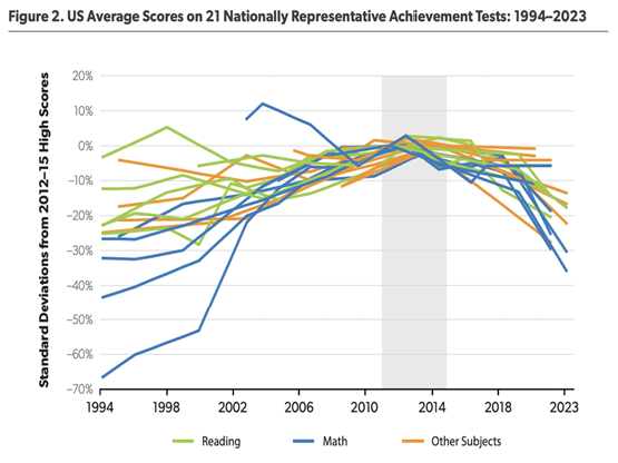
To find out what’s going on—and to help kids get back on track—it’s important to understand the nuances of the data and the depth and breadth of the declines. Let me set the stage using a few of my favorite graphs. First up is this doozy from Nat Malkus at AEI. He pulled data from a range of tests to show that American achievement scores on a range of different subjects and grade levels all followed a relatively similar pattern of gains and then declines.
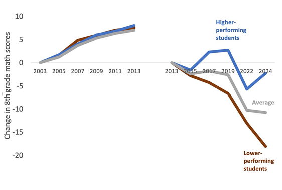
 When I looked at this for The 74, I dubbed it “A Tale of Two Eras.” I zeroed in on one particular facet of the declines: they have not been universal or uniform. In fact, when scores started falling, it was the students who were already behind who suffered the earliest and largest declines. Unlike their higher-performing peers, the lowest-performing students have also not shown signs of a rebound yet.
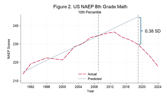
 As these charts make very clear, the declines started well before COVID. Earlier this spring, Jim Wyckoff published an excellent working paper looking into these patterns and their potential causes. Again, he showed that the positive trend lines started to break around 2013. But he added one extra layer by noting that, by 2019, the lowest-performing students were already the equivalent of 8 months behind (which his chart shows as 38 percent of a standard deviation.)
 Scores continued to fall during COVID, further exposing the declines and the growing gaps. We have still not seen many signs of recovery, especially in reading (but for some notable outliers).
Now here we are. And amidst all of this, the Trump Administration has shown relatively little curiosity about what might be driving these trends and has, in fact, cut a lot of research efforts that would have shed more light on them.
So we’ve got some headwinds going against us. How can we get things back on track? What do we need to learn, and where should researchers be looking for answers? I hope you’ll join us for the conversation next week.